Microsoft have been making lots of improvements to Office, especially with the release of Office 2016 last September
As updates and improvements become more continuous and agile, we can expect to see more improvements being rolled out in minor updates rather than a major release.
The benefit of this is regularly having access to lots of new features – and there’s one brilliant new trick in Excel we wanted to share. Excel 2016 now has a selection of business analysis feature tours, that show you how you can use Power Pivot to create brilliant data visualisations easily.
My favourite is the ‘My Calendar’ tour, which connects to your Exchange Server and analyses all your calendar meetings before putting them into simple, effective tables and charts. With a few clicks and one dashboard you can see:
- Who you meet the most with
- Most popular times of day for your meeting
- How many you attend vs organise
- Time spent in meetings and lots more
It takes about 3 minutes, so why not give it a go now? Here’s how:
Update: This is no longer automatically within Excel but you can download the template here.
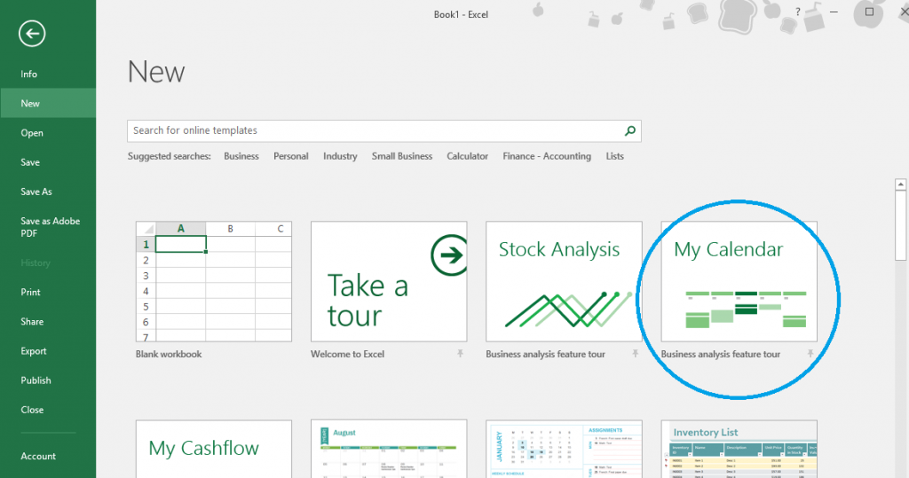
Go into Excel 2016 and you will first see a selection of templates. Select ‘My Calendar’
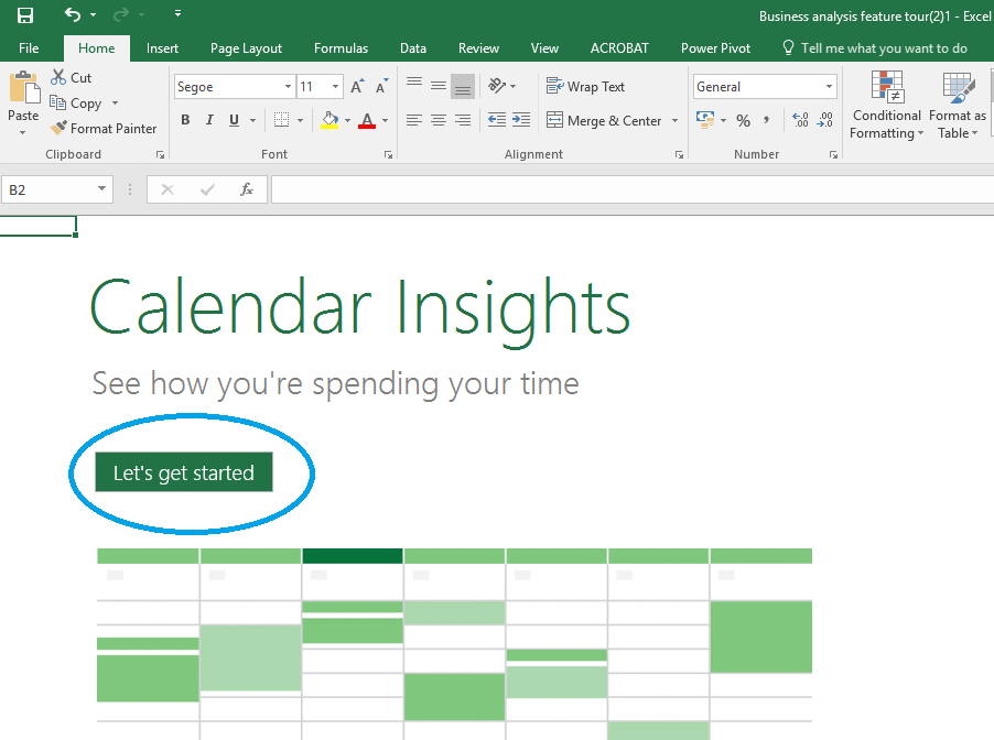
Click ‘Let’s get started’
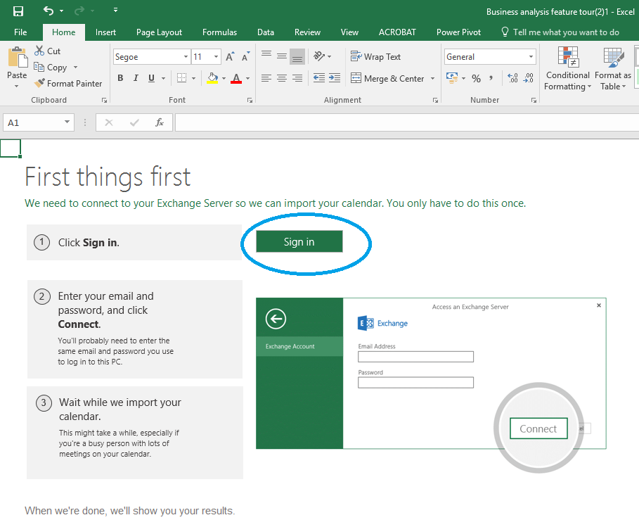
Click ‘Sign in’ and enter your credentials
That’s it! You will have a dashboard like the one below and can click and interact with the data to filter it.

If you want any more information you can click the final tab ‘Learn more’ and use the links to find out more about Power Pivot – enjoy!